In almost all countries, after universal lockdowns were mandated around March 20, 2020, supposed ‘deaths’ from COVID19 suddenly shot up. The lockdowns were supposedly a reaction to ‘flatten the curve’ before the virus ‘hit us’. Within months, it was revealed via blood-donor sample analysis and sewage analysis, that the virus was in almost all western countries many months before March 2020. The ‘deaths’ only showed up as soon as they started using the faulty PCR test above 35 cycles (where it catches everything as SARSCOV2-related). Hypothesis: SARSCOV2 virus floating around months before March 2020, deaths only spiked when/due to lockdowns, coincidental with mass false PCR testing to show 1000’s of ‘cases’ suddenly just arrived, as if the virus behaved like in a Hollywood movie.
Here’s a series of countries, charts showing lockdown dates and the mythical ‘arrival’ of the virus (later to be found that SARSCOV2 was around months prior):


From ‘el gato-malo’ : ‘Everyone always wants to know about covid restrictions, so let’s start there. i used this data and compared it to the wallethub freedom index because it’s pretty accurate and provides a nice, simple number that includes mitigations like masking and school policy that are absent from sets like google mobility data. is it perfect? no. is it good enough that if there’s a strong signal here we should see it? yes, i think so.’

There is no signal.
“What you did to try to stop covid appears to have had no effect on all cause deaths. This is a result I pulled out dozens of times using google mobility data vs covid deaths as well back when internet felines were still permitted over at casa del bluebird. it looks to hold even now.”
None of this policy worked.
You can have correlation without causality, but material causality without correlation is extremely implausible to the point of more or less requiring special pleading.
Looking for a ‘dent’ should also be visible comparing Florida (abandoned lockdown) versus California (strict lockdown). Or Sweden versus the UK, or North Dakota versus South Dakota. These pairs have similar climates and so same seasonality. Doing this over 50 times (States) looks for ANY correlation (above) yet none is found.


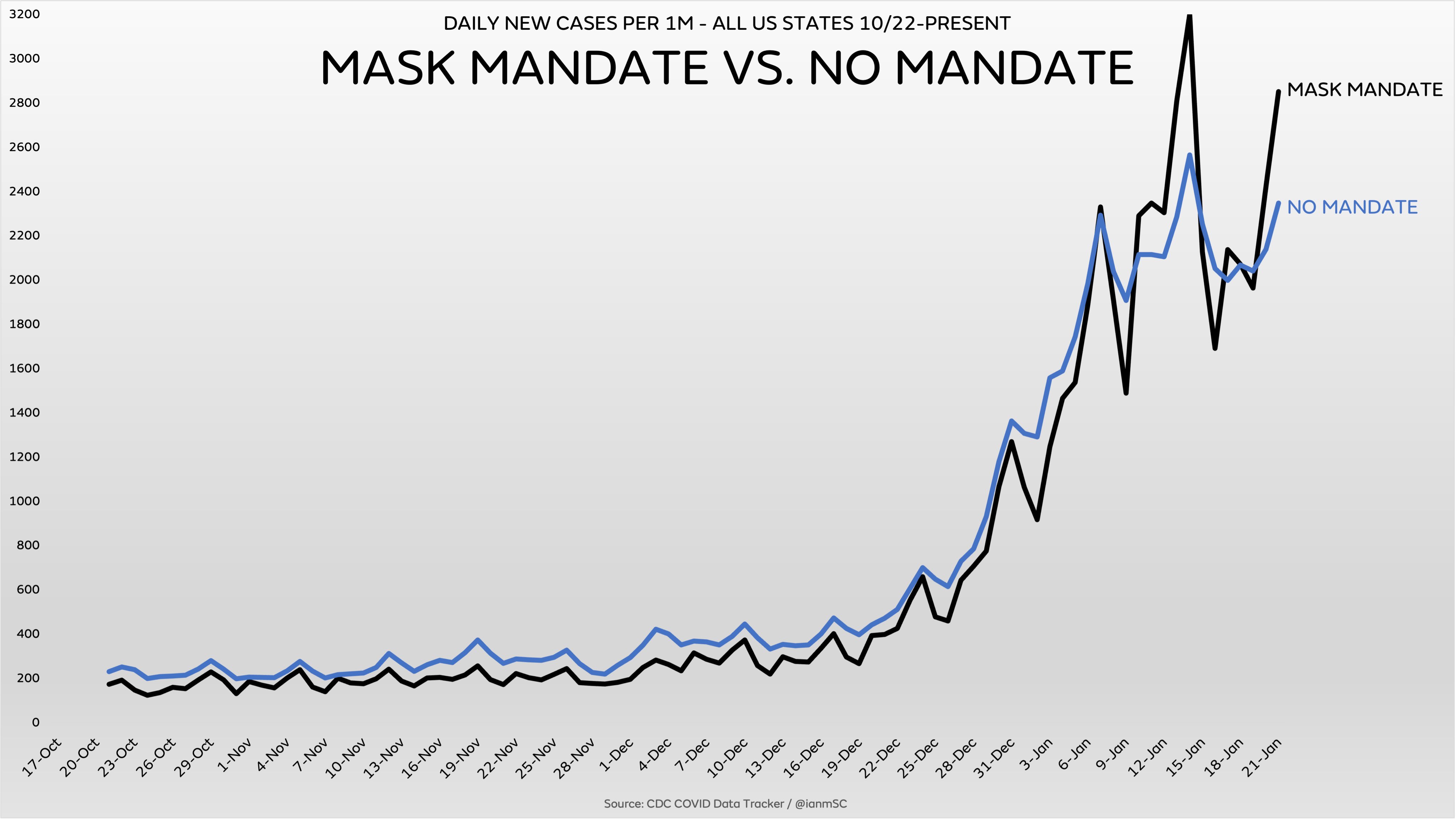
The same analysis was done for masking. There was no ‘dent’ in any signal (ICU hospitalizations, deaths ‘with C19’, etc.) when comparing harsh mask adherence/mandates to none or lax mask adherence. In almost all locations, the shape/curve of cases or deaths would follow the same up/down outbreak (Gompertz) curve. One example, Florida and Texas, almost zero mask mandates and/or very low mask usage, versus California, very strict mandates and usage. The best compilation of these are at Ian Miller’s feed: Ian Miller (@ianmSC) / Twitter

And in general, mask mandate counties versus those without mandates. Even putting aside how much mask usage there is, this still shows no dent or change: